In the previous post, we dealt with theming tabs in the Android ActionBar. The ActionBar provides an alternate type of navigation – a drop-down list. You can specifically request this via:
actionBar.setNavigationMode(ActionBar.NAVIGATION_MODE_LIST);
or you can sometimes unexpectedly find yourself in this situation if you try to create a lot of tabs, since Android may choose to convert tab navigation to list navigation on itself. In this post, we’ll focus on how to theme the ActionBar components that are involved in list navigation.
List navigation involves two components. First, there is the Spinner that is embedded in the ActionBar, which displays the current selection, and which allows the use to begin the process of choosing a new selection. Second, there is the drop-down list that is displayed when the user does attempt to choose a new selection. These are all logically part of the Spinner, so they are themed together.
The style for the spinner is referenced from the main theme as follows:
    <style name="SBT.App.Theme" parent="@style/Theme.Sherlock">
        ...
        <item name="actionDropDownStyle">@style/SBT.DropDown.Style</item>
        ...
    </style>
Like the tabs, the spinner has a background that can be controlled using a state-sensitive drawable. This background can be styled as follows:
    <style name="SBT.DropDown.Style" parent="@style/Widget.Sherlock.Spinner.DropDown.ActionBar">
        <item name="android:background">@drawable/actionbar_spinner_background</item>
    </style>
Note that here ActionBarSherlock re-uses the standard Android item names, rather than having its own parallel ones. This means that we don’t have to provide this information twice the way we had to for the tabs. If you’re not using ActionBarSherlock, the parent style would be @android:style/Widget.Holo.Light.Spinner.
As with the tabs, the actionbar_spinner_background is a selector drawable defined in XML:
<selector xmlns:android="http://schemas.android.com/apk/res/android">
    <item android:drawable="@drawable/spinner_background_disabled" android:state_enabled="false"/>
    <item android:drawable="@drawable/spinner_background_pressed" android:state_pressed="true"/>
    <item android:drawable="@drawable/spinner_background_focused" android:state_focused="true" android:state_pressed="false"/>
    <item android:drawable="@drawable/spinner_background_default"/>
</selector>
Here, we really only care about four states:
- Disabled
- Enabled and pressed
- Enabled, not pressed but focused
- Enabled and not pressed or focused
Although we could specify all the combinations the way we did with the tabs, this time we can take advantage of the fact that Android will process the <item>s in order, selecting the first one that matches.
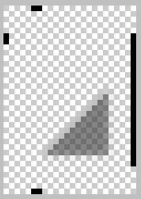
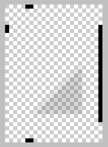
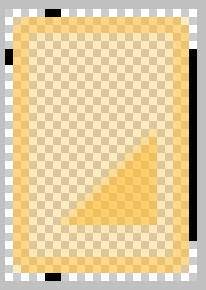
The four drawables listed for the spinner background are 9-patch PNG’s:
 |
 |
 |
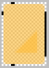 |
| default | disabled | focused | pressed |
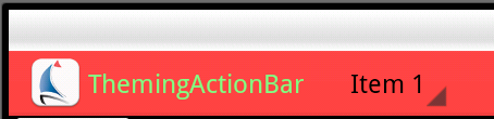
As you can see, these use transparency to allow some of the background to show through. You can obviously change this if you want. With these, the spinner looks like this when idle:
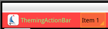
If the user uses the keyboard to focus the spinner:
And while the keyboard button is pressed (or while the user has his/her finger on the spinner):
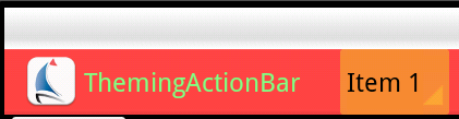
(I warned you in advance this app would be ugly.)
Once the user has activated the spinner, it creates a drop-down list in order to display the available choices to the user. The drop-down list can be themed (using the same style as mentioned above for the spinner) by adding two additional elements:
    <style name="SBT.DropDown.Style" parent="@style/Widget.Sherlock.Spinner.DropDown.ActionBar">
        <item name="android:background">@drawable/actionbar_spinner_background</item>
        <item name="android:popupBackground">@drawable/actionbar_dropdown_background</item>
        <item name="android:dropDownSelector">@drawable/actionbar_dropdown_selector</item>
    </style>
The android:popupBackground item selects a drawable that will be used to draw the background of the drop-down list. In our example app, for simplicity, we simply use a solid-colored rectangle specified in XML:
<shape xmlns:android="http://schemas.android.com/apk/res/android" android:shape="rectangle">
    <solid android:color="@color/spinnerDropdownBackground" />
</shape>
One could easily substitute a 9-patch PNG, of course. The appearance of the items within the drop-down list are similarly controlled by the android:dropDownSelector item:
<selector xmlns:android="http://schemas.android.com/apk/res/android" android:exitFadeDuration="@android:integer/config_mediumAnimTime">
    <item android:drawable="@drawable/list_entry_focused" android:state_focused="true" android:state_pressed="false"/>
    <item android:drawable="@drawable/list_entry_pressed" android:state_pressed="true"/>
    <item android:drawable="@android:color/transparent"/>
</selector>
Here, as with the spinner itself, we provide for “focused but not pressed” and “pressed” states. The final state (“none of the above”) simply uses a transparent color to show the background we set up. Again, because we’re just trying to illustrate the principles, the first two drawables are just done in XML:
list_entry_focused.xml:
<shape xmlns:android="http://schemas.android.com/apk/res/android" android:shape="rectangle">
    <solid android:color="@color/spinnerDropdownBackground_focus" />
</shape>
list_entry_pressed.xml:
<shape xmlns:android="http://schemas.android.com/apk/res/android" android:shape="rectangle">
    <solid android:color="@color/spinnerDropdownBackground_pressed" />
</shape>
Using appropriately eye-hurting colors:
<resources>
    ...
    <color name="spinnerDropdownBackground">#C25283</color>
    <color name="spinnerDropdownBackground_focus">#8080FF</color>
    <color name="spinnerDropdownBackground_pressed">#00FF00</color>
</resources>
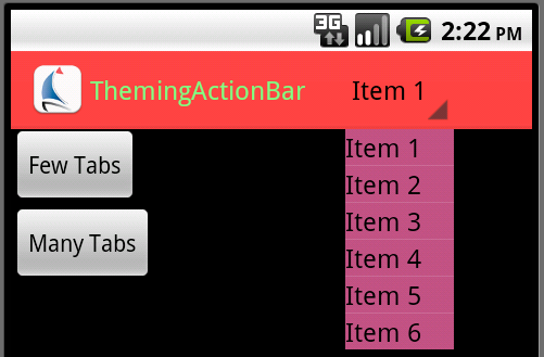
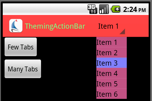
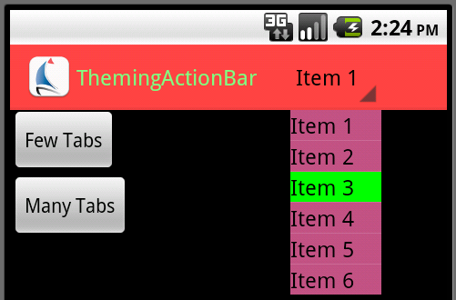
the drop-down looks like this just after being pulled down:
With an item focused (keyboard navigation):
And with finger or keyboard down:
In the final post in this series, we will look at styling menu items (a.k.a. action buttons) within the ActionBar.