So far, we’ve covered theming tabs on an Android ActionBar, as well as drop-down navigation lists. The final item to be covered are buttons embedded within the ActionBar.
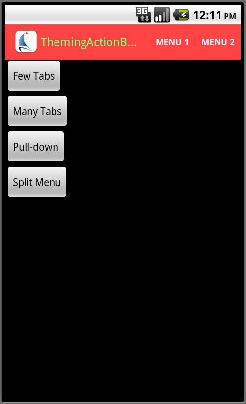
Buttons within the ActionBar are implemented by the standard “options menu” code, with the menu’s XML item entries having an android:showAsAction attribute set to ifRoom or always. There are a number of different ways that the ActionBar can appear if there are more menu entries than will fit.
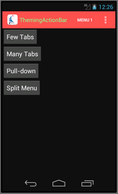
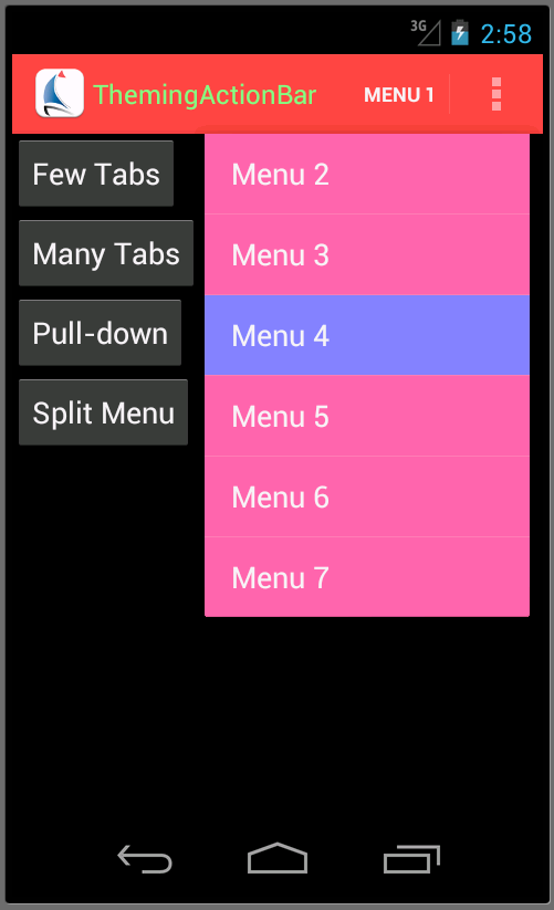
If the device on which your app is running has a physical “menu” button, as the older handsets do, and if you didn’t select a “split” ActionBar, the ActionBar shows as many items as will fit. Additional items appear at the bottom when you press the menu button:
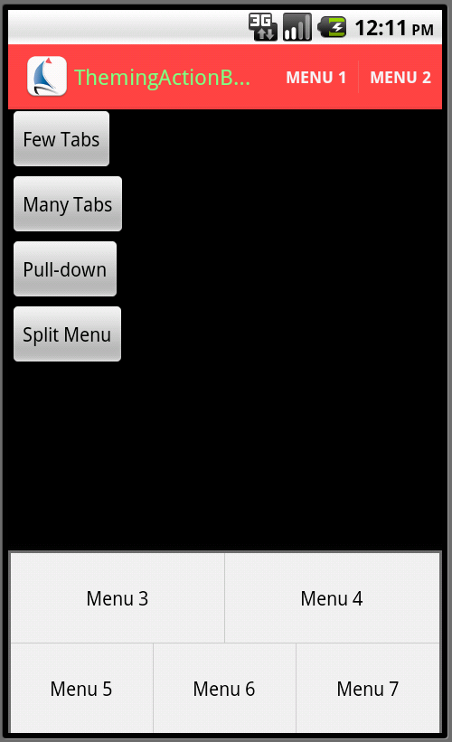
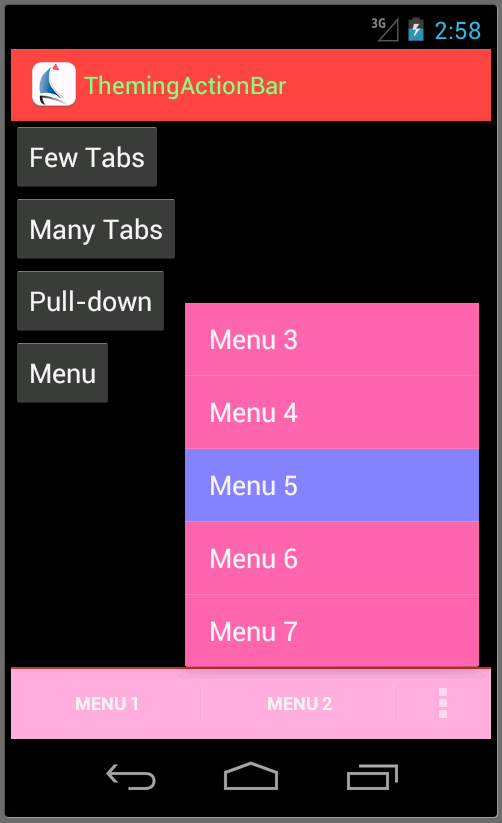
If you have selected a “split action bar” by adding the android:uiOptions="splitActionBarWhenNarrow" option to your activity’s definition, the items are instead displayed across the bottom of the screen. Again, as many as will fit are displayed, and a pop-up menu is used to show the others when the user presses the “menu” button.
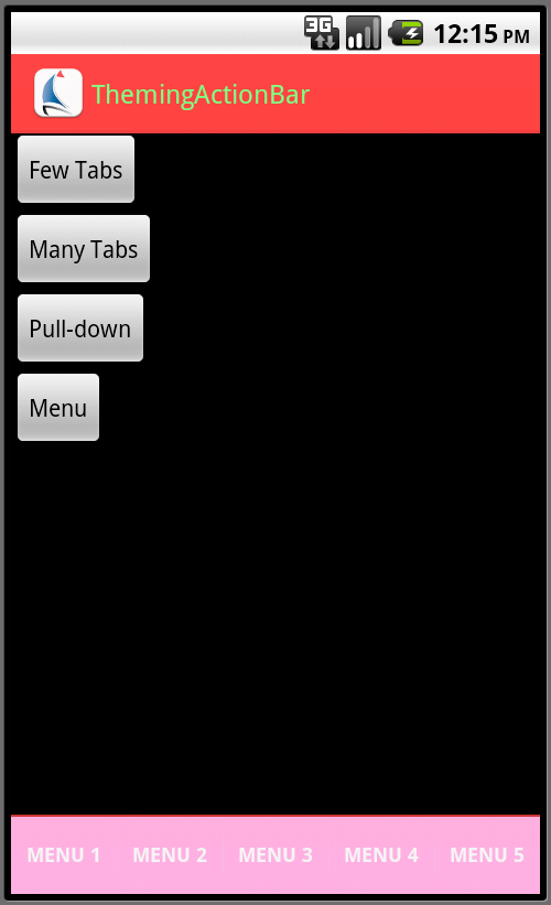
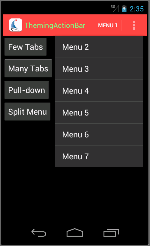
If the device does not have a physical menu button, as is typical for later devices, the overflow is instead handled with a “…” item. This appears in the ActionBar in the unsplit case:
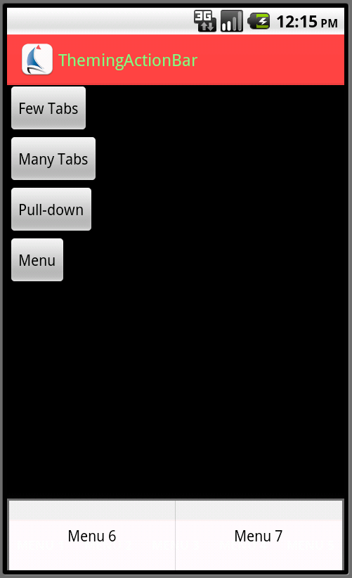
and in the split bar in the split case:
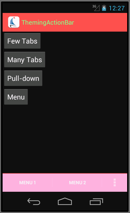
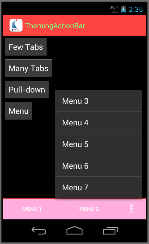
As you can see, some of our theming from the previous steps has carried over – the pink background on the split bar was put in place by the backgroundSplit item we specified in the SBT.ActionBar.Style style for the ActionBar as a whole during the first post. What we need to deal with now are the appearance of the action bar items, and the corresponding popup menus.
You will probably not be surprised to find out that the background of the individual action bar items are controlled by an item named actionBarItemBackground for ActionBarSherlock and android:actionBarItemBackground for the built-in ActionBar:
    <style name="SBT.App.Theme" parent="@style/Theme.Sherlock">
        ...
        <item name="android:actionBarItemBackground">@drawable/actionbaritem_background</item>
        ...
    </style>
As with the tabs, a “selector” drawable is usually what you want, so that the “focused” and “pressed” states show up properly:
<selector xmlns:android="http://schemas.android.com/apk/res/android" android:exitFadeDuration="@android:integer/config_mediumAnimTime">
    <item android:drawable="@drawable/actionbaritem_focused" android:state_focused="true" android:state_pressed="false"/>
    <item android:drawable="@drawable/actionbaritem_pressed" android:state_pressed="true"/>
    <item android:drawable="@android:color/transparent"/>
</selector>
There is one quirk that might not be obvious, however – the area of the ActionBar that contains the logo and the application title is itself an “action bar item.” Thus, if you attempt to style the background of the “menu” items for the “default” case, that styling also gets applied in that region. I found this a nuisance in an application that used a texture in the ActionBar that I wanted behind the title, but not in the menu areas.
The overflow popup menu is styled using two items out of the theme:
    <style name="SBT.App.Theme" parent="@style/Theme.Sherlock">
        ...
        <item name="popupMenuStyle">@style/SBT.OverflowMenu.Style</item>
        <item name="dropDownListViewStyle">@style/SBT.OverflowMenu.ListView</item>
        ...
    </style>
    ...
    <style name="SBT.OverflowMenu.Style" parent="@style/Widget.Sherlock.ListPopupWindow">
         <item name="android:popupBackground">@drawable/actionbar_dropdown_panel_background</item>
    </style>

    <style name="SBT.OverflowMenu.ListView" parent="@style/Widget.Sherlock.ListView.DropDown">
        <item name="android:listSelector">@drawable/actionbar_dropdown_selector</item>
    </style>
The first provides the background behind the pop-up menu, while the second provides the selector that will be used to highlight individual menu entries as they are focused and/or selected. Here we’ve chosen to re-use the assets from the spinner drop-down list, but this obviously isn’t required. This provides the required styling on the pop-up menus:
We still have the issue of the options menu-style overflow menu that is displayed on older devices when using ActionBarSherlock. This is a more challenging problem. Android provides styling support allowing you to change the background of the options menu:
<resources>
    <style name="SBT.App.Theme" parent="@style/Theme.Sherlock">
        ...
        <item name="android:panelBackground">@drawable/actionbar_dropdown_panel_background</item>
        <item name="android:panelFullBackground">@drawable/actionbar_dropdown_panel_background</item>
        ...
    </style>
but to change the other colors (text color, focus and pressed color) you have to resort to writing custom code to fiddle with some of the menu functionality. From discussions on various sites on the Internet, this is a non-trivial operation, and getting it to work across different versions of Android reliably is a challenge, so we’re not going to dive into that.
So that concludes the basics of theming the ActionBar. There are a few advanced topics that we haven’t covered:
- Handling “contextual action bars” for modal activities. These work just the way that the standard action bar does, with the addition of an item named
actionModeCloseButtonStylethat controls the styling of the button designed to close the modal activity. - Handling the theming for controls (other than action bar items) embedded inside the ActionBar. These are, for the most part, handled the same way you would if you were theming them in a standalone fashion. The Android SDK documentation covers the various options for each of the controls.
I should also point out that Jeff Gilfelt has created an ActionBar Style Generator that does a very nice job of generating both style entries and assets for both Holo-based and ActionBarSherlock-based themes. In addition, Android Holo Colors Generator by Jérôme Van Der Linden will help generate assets for many of the other Android controls.