Since Android 3.0 (a.k.a. “Honeycomb”) the ActionBar has been the workhorse of “standard” Android user interfaces. The nice folks over at ActionBarSherlock.com have also created a set of classes and resources that allow you to build ActionBar-based UI’s all the way back to Android 2.0 (“Eclair”).
Unfortunately, customizing the look of the ActionBar is not, in my opinion, incredibly well documented. In addition, it’s a bit complex, because the ActionBar can be displayed in a variety of different ways depending on what options you select in your app and the size of the screen. This is the first in a series of posts that attempts to provide some detail on the various theming options that are available, and how to take advantage of them.
This post will focus on providing style for tabs in the ActionBar. Thus, without further ado, we present The World’s Ugliest Android Application, since the colors were chosen to illustrate concepts, not to be visually pleasing.
Because ActionBarSherlock is so common (in my experience), we will focus on theming it. It’s pretty straightforward to get rid of ActionBarSherlock if your application isn’t using it – we’ll discuss this at the end.
Setting up a tabbed ActionBar in your application is pretty straightforward – you would typically have code similar to this in the onCreate method of your Activity:
		ActionBar actionBar = getSupportActionBar();
		actionBar.setNavigationMode(ActionBar.NAVIGATION_MODE_TABS);

		actionBar.addTab(actionBar.newTab().setText(R.string.tab1).setTabListener(this));
		actionBar.addTab(actionBar.newTab().setText(R.string.tab2).setTabListener(this));
		actionBar.addTab(actionBar.newTab().setText(R.string.tab3).setTabListener(this));
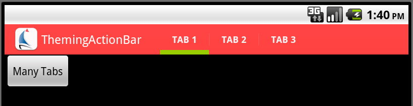
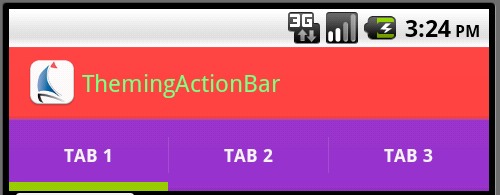
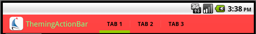
There are two fundamental ways that Android is likely to display the ActionBar for an activity configured like this. First, if there is enough space, Android will display a “single-line” ActionBar with the tabs embedded in it:
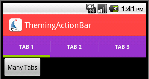
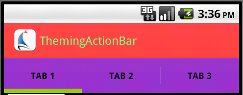
If the screen is too narrow for Android’s liking (as is typically the case for a phone in portrait orientation), Android will, instead, move the tabs to a second line. This is referred to as being “stacked,” and should not be confused with a “split” ActionBar. You, as the application designer, do not have a way to force when or if Android will stack tabs – that’s entirely up to the operating system. Stacked tabs look like this:
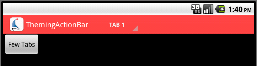
If the number of tabs gets too large, however, Android will change the way the tabs are displayed. In the “it’s wide enough” case, Android will still display in single-line mode, but will transform the tabs into a pull-down list:
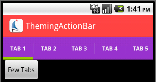
The “stacked” mode doesn’t fundamentally change the look and feel – the row of tabs simply becomes horizontally-scrollable:
To understand how tabs are displayed, you have to realize that they are “drawn” in, effectively, three “layers.”
- The first thing that Android draws is the background layer.
- On top of that, Android draws the tab itself.
- Finally, Android draws the text and/or icon within the tab.
First, let’s handle the backgrounds. Android uses a system of “nested styles” for the ActionBar, which ActionBarSherlock parallels. Thus, the main style for the application or activity uses a nested style to control the ActionBar’s background:
    <style name="SBT.App.Theme" parent="@style/Theme.Sherlock">
        <item name="actionBarStyle">@style/SBT.ActionBar.Style</item>
    <style/>

    <style name="SBT.ActionBar.Style" parent="@style/Widget.Sherlock.ActionBar.Solid">
        <item name="background">@drawable/actionbar_background_main</item>
        <item name="backgroundStacked">@drawable/actionbar_background_stacked</item>
        <item name="backgroundSplit">@drawable/actionbar_background_split</item>
    </style>
As you can see, the ActionBar has three potential backgrounds. The background item provides the main background for the ActionBar – the red in our sample app. The backgroundStacked item provides the background for the “stacked” region – the purple in our application. The backgroundSplit item provides the background for the portion of the ActionBar that is split off to the bottom if your application enables that, and if Android chooses to use it. We’ll deal with that in another post.
In our application, these backgrounds are 9-patch drawables. actionbar_background_main.9.png looks like this:
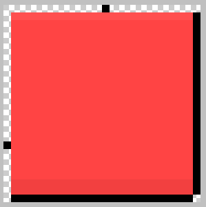
(If you don’t understand 9-patch images, I suggest you check out this post: http://radleymarx.com/blog/simple-guide-to-9-patch/) From a purely 9-patch point of view there appears to be a lot of wasted space in this image, however I suspect that it is sized the way it is to deal with the minimum size of the ActionBar, so I’m sticking with that layout. The dimensions for this image (not including the extra rows/columns for 9-patching) are:
| Resolution | Image size | Stretch Row |
|---|---|---|
| mdpi | 24×24 | 18 |
| hdpi | 36×36 | 30 |
| xhdpi | 48×48 | 42 |
Next, let’s look at the tab graphics itself. This is drawn as an overlay on top of the appropriate background (“main” or “stacked”). It also is a “nested” style:
    <style name="SBT.App.Theme" parent="@style/Theme.Sherlock">
        ...
        <item name="actionBarTabStyle">@style/SBT.ActionBarTab.Style</item>
        ...
    </style>
    <style name="SBT.ActionBarTab.Style" parent="@style/Widget.Sherlock.ActionBar.TabView">
        <item name="android:background">@drawable/action_bar_tab</item>
    </style>
The action_bar_tab drawable is a “selector” drawable. Selector drawables provide different rendering based on the state of the object. A tab object actually has eight possible states:
- Most importantly, the tab could be selected or not. By convention, selected tabs are drawn with a highlight bar (green, in our case) across the bottom.
- Second, the tab could be currently “pressed” or not. “Pressed” obviously indicates that the user is in the process of pushing down on that tab in order to select or re-select it.
- Finally, the tab could have the input focus or not. We tend to focus so much on touch navigation, that we sometimes forget that some devices have “hard” keyboards, and allow keyboard-based navigation. To handle such situations, it is wise to tweak the display a bit to allow someone to see which tab currently has the focus.
Although the “true/false” variations on all three of the variables above theoretically produce eight unique combinations, it is fairly common for applications to only provide six. First, it is fairly common for the “not focused, not selected, not pressed” state to simply be transparent, so that the background of such a tab simply shows the underlying ActionBar background. This is the way our application is designed. This might now always be what you want, however – if the ActionBar background is highly textured, you might want to provide a non-textured background to help make the tab text more readable. Second, it usually isn’t necessary to distinguish between “pressed via touch” and “pressed via keyboard navigation.” A single “pressed” state will usually be sufficient, and thus it’s quite common for those two combinations to actually use the same visual representation. Thus, the action_bar_tab.xml file might look as follows:
<?xml version="1.0" encoding="utf-8"?>
<selector xmlns:android="http://schemas.android.com/apk/res/android">
	<!-- Not selected states -->
    <item android:drawable="@android:color/transparent" android:state_focused="false" android:state_pressed="false" android:state_selected="false"/>
    <item android:drawable="@drawable/tab_unsel_focus" android:state_focused="true" android:state_pressed="false" android:state_selected="false"/>
    <item android:drawable="@drawable/tab_unsel_down" android:state_focused="false" android:state_pressed="true" android:state_selected="false"/>
    <item android:drawable="@drawable/tab_unsel_down" android:state_focused="true" android:state_pressed="true" android:state_selected="false"/>

    <!-- Selected states -->
    <item android:drawable="@drawable/tab_sel_up" android:state_focused="false" android:state_pressed="false" android:state_selected="true"/>
    <item android:drawable="@drawable/tab_sel_focus" android:state_focused="true" android:state_pressed="false" android:state_selected="true"/>
    <item android:drawable="@drawable/tab_sel_down" android:state_focused="false" android:state_pressed="true" android:state_selected="true"/>
    <item android:drawable="@drawable/tab_sel_down" android:state_focused="true" android:state_pressed="true" android:state_selected="true"/>
</selector>
The various tab_ drawables would then typically be implemented as 9-patch files. Here is our mdpi tab_sel_up.9.png file, which is the unpressed, unfocused, selected state.
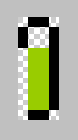
As you can see, this image provides the fixed-size solid green bar at the bottom of the image, and then has a stretchable, transparent area above it, allowing the underlying background to show through. The dimension of the “selected bar” area at the bottom is as follows:
| Resolution | Height |
|---|---|
| mdpi | 6 |
| hdpi | 9 |
| xhdpi | 12 |
Styling the text also requires the use of nested styles. To style the title text in the ActionBar itself:
    <style name="SBT.ActionBar.Style" parent="@style/Widget.Sherlock.ActionBar.Solid">
        ...
        <item name="titleTextStyle">@style/SBT.ActionBarText.Style</item>
        ...
    </style>

    <style name="SBT.ActionBarText.Style" parent="@android:style/TextAppearance">
        <item name="android:textColor">@color/actionBarText</item>
    </style>
And with the corresponding color:
<resources>
    ...
    <color name="actionBarText">#80FF80</color>
    ...
</resources>
the title text is now a light green:
Note that the title style is “rooted” on the actionBarStyle, not on the main application style.
A similar actionBarTabTextStyle (this time off the top-level application theme), allows customizing the text in the tabs:
    <style name="SBT.App.Theme" parent="@style/Theme.Sherlock">
        ...
        <item name="actionBarTabTextStyle">@style/SBT.ActionBarTabText.Style</item>
        ...
    </style>

    <style name="SBT.ActionBarTabText.Style" parent="@style/Widget.Sherlock.ActionBar.TabText">
        <item name="android:textColor">@color/actionBarTabText</item>
    </style>
<resources>
    ...
    <color name="actionBarTabText">#000000</color>
    ...
</resources>
Although I’ve only shown changing the color of the text, any standard text styles could be applied just as easily. Here’s what the corresponding “wide version” of the tabs looks like:
So far we’ve been focusing on the styles that are specific to ActionBarSherlock. These parallel the themes that Android uses itself, just without the android: prefix. To make the application work on Android 3.0 and later, where ActionBarSherlock gets out of the way and just allows the “real” ActionBar to come through, you need to specify the Android version of the styles as well. This is most easily done by specifying a values-14/styles.xml file, which Android will pick up on 3.0 and later. Give what we’ve done already, this file would contain:
<resources>

    <style name="SBT.App.Theme" parent="@style/Theme.Sherlock">
        <item name="android:actionBarStyle">@style/SBT.ActionBar.Style</item>
        <item name="android:actionBarTabStyle">@style/SBT.ActionBarTab.Style</item>
        <item name="android:actionBarTabTextStyle">@style/SBT.ActionBarTabText.Style</item>
    </style>

    <style name="SBT.ActionBar.Style" parent="@style/Widget.Sherlock.ActionBar.Solid">
        <item name="android:background">@drawable/actionbar_background_main</item>
        <item name="android:backgroundStacked">@drawable/actionbar_background_stacked</item>
        <item name="android:backgroundSplit">@drawable/actionbar_background_split</item>
        <item name="android:titleTextStyle">@style/SBT.ActionBarText.Style</item>
    </style>
</resources>
If you’re not using ActionBarSherlock, you can use these settings in lieu of the ones given earlier, and simply change the parent themes accordingly. The parent for SBT.App.Theme should be based on a system theme such as @android:style/Theme.Holo.Light, while the SBT.ActionBar.Style should be based on the corresponding ActionBar widget style (e.g. @android:style/Widget.Holo.Light.ActionBar.Solid).
That is enough theming for many tab-based applications. Remember, however, that we also have to handle the case where we are in “wide mode” (i.e. tabs still embedded in the “main” portion of the ActionBar as shown just above), but where there are enough tabs that Android decides to render the tabs as a pull-down menu as well. We’ll handle that in the next post.